In e-commerce, visual appeal plays a crucial role in capturing your customers’ attention. High-quality product images can boost conversion rates by establishing trust and creating an emotional connection. Shopify stores often use modal images and buy buttons to enhance user interaction. By enlarging these elements, you can improve usability and make your store more engaging. This not only enhances the shopping experience but also helps reduce cart abandonment. Discovering how to enlarge modal images and buy buttons in Shopify stores can significantly impact your store’s success.
Understanding Modal Images in Shopify
What are Modal Images?
Definition and Purpose
Modal images pop up on your screen when you click on a product image. They provide a closer look at the product, enhancing your shopping experience. These images help you see details that might not be visible in smaller thumbnails. By using modal images, you can create a more interactive and engaging store.
Common Uses in Shopify Stores
In Shopify stores, modal images often showcase product details. You might find them used for lifestyle shots or in-context images. These visuals help you understand the product’s features and benefits. Shopify themes allow large images to scale with the browser, adapting to different screen sizes. This flexibility ensures that your customers always get the best view of your products.
Importance of Image Size
Impact on User Experience
Image size plays a crucial role in user experience. Larger images let you zoom in and explore products more thoroughly. This interaction can lead to better understanding and satisfaction. When you can see every detail, you feel more confident in your purchase decisions. Shopify’s customization options, like setting focal points, enhance this experience by focusing on key product areas.
SEO Considerations
Image size also affects SEO. Larger, high-quality images can improve your store’s search engine ranking. They make your site more appealing to both users and search engines. However, you need to balance size with loading speed. Shopify automatically compresses images to maintain fast page loading times, which is essential for keeping visitors on your site.
By understanding how to enlarge modal images and buy buttons in Shopify stores, you can significantly enhance your store’s visual appeal and functionality.
Techniques to Enlarge Modal Images

Enhancing the size of modal images in your Shopify store can make a big difference in how customers interact with your products. Let’s explore some effective techniques.
Using Shopify’s Built-in Features
Step-by-step Guide
Shopify offers built-in features that allow you to adjust modal image sizes easily. Here’s how you can do it:
- Access Your Shopify Admin: Log in to your Shopify account and navigate to the “Online Store” section.
- Select Themes: Click on “Themes” and then “Customize” to open the theme editor.
- Locate Image Settings: Find the section related to product images or modals. This might vary depending on your theme.
- Adjust Image Size: Use the available options to increase the image size. Some themes offer sliders or dropdowns for this purpose.
- Preview Changes: Always preview your changes to ensure they look good on different devices.
- Save Your Work: Once satisfied, save the changes to apply them to your store.
Limitations and Considerations
While Shopify’s built-in features are convenient, they may not offer complete flexibility. Some themes might restrict how much you can enlarge images. Also, remember that larger images can affect loading times. Always balance size with performance to keep your store running smoothly.
Customizing with CSS
Basic CSS Modifications
If you want more control over how to enlarge modal images and buy buttons in Shopify stores, CSS customization is a great option. Here’s a simple way to start:
- Access Theme Code: Go to “Online Store” > “Themes” > “Actions” > “Edit Code.”
- Find the CSS File: Look for the “Assets” folder and open the CSS file, usually named “theme.scss.liquid” or similar.
- Add Custom CSS: Insert CSS code to adjust the modal image size. For example:
- Test Your Changes: Save and preview to see how the changes affect your store.
Advanced CSS Techniques
For those comfortable with coding, advanced CSS techniques can offer even more customization:
- Media Queries: Use media queries to ensure images look great on all devices.
- Transform and Scale: Apply CSS transformations to create dynamic effects when users hover over images.
- Layering and Positioning: Experiment with layering and positioning to enhance visual appeal.
By mastering these techniques, you can significantly improve how to enlarge modal images and buy buttons in Shopify stores, making your site more attractive and user-friendly.
Understanding Buy Buttons in Shopify
What are Buy Buttons?
Definition and Functionality
Buy buttons in Shopify are powerful tools that let you sell products directly from any website. They work seamlessly across platforms like WordPress and Wix. When customers click a buy button, they go straight to checkout, skipping the cart. This makes the buying process quick and easy. You can customize these buttons to match your brand by adjusting colors, text, and layout.
Placement and Design Considerations
Placing buy buttons strategically on your site can boost sales. Think about where your customers are most likely to make a purchase decision. Common spots include product pages, blog posts, or even pop-ups. Design matters too. Make sure the button stands out with a clear call-to-action like “Buy it now.” A well-placed and designed button can guide your customers smoothly through the buying journey.
Importance of Button Size
User Interaction and Conversion Rates
The size of your buy button can impact how users interact with your store. Larger buttons are easier to click, especially on mobile devices. This ease of use can lead to higher conversion rates. When customers find it simple to complete a purchase, they’re more likely to do so. Make sure your buttons are big enough to be noticeable but not overwhelming.
Accessibility Considerations
Accessibility is crucial for reaching all potential customers. Ensure your buy buttons are accessible to everyone, including those with disabilities. Use contrasting colors to make them stand out. Also, provide alternative text for screen readers. By considering accessibility, you create an inclusive shopping experience that welcomes all users.
Techniques to Enlarge Buy Buttons

Enhancing the size of buy buttons in your Shopify store can make a big difference in user interaction. Let’s dive into some effective methods.
Using Shopify’s Theme Editor
Step-by-step Guide
You can easily adjust buy button sizes using Shopify’s Theme Editor. Here’s how:
- Log into Shopify: Head to your Shopify admin and click on “Online Store.”
- Select Your Theme: Choose “Themes” and hit “Customize” to open the editor.
- Find Button Settings: Navigate to the section where buy buttons are located. This might vary based on your theme.
- Adjust Size: Use the available tools to increase the button size. Some themes offer sliders or input fields for this.
- Preview Changes: Check how the changes look on different devices to ensure consistency.
- Save Your Work: Once satisfied, save the changes to apply them to your store.
Customization Options
Shopify’s Theme Editor provides various customization options. You can change colors, fonts, and even add animations. These tweaks help your buttons stand out and align with your brand. Experiment with different styles to find what works best for your audience.
Customizing with CSS
Basic CSS Modifications
For more control over how to enlarge modal images and buy buttons in Shopify stores, CSS customization is a great option. Here’s a simple way to start:
- Access Theme Code: Go to “Online Store” > “Themes” > “Actions” > “Edit Code.”
- Locate the CSS File: Open the “Assets” folder and find the CSS file, usually named “theme.scss.liquid.”
- Add Custom CSS: Insert CSS code to adjust the button size. For example:
- Test Your Changes: Save and preview to see how the changes affect your store.
If you’re comfortable with coding, advanced CSS techniques can offer even more customization:
If you’re comfortable with coding, advanced CSS techniques can offer even more customization:
- Media Queries: Ensure buttons look great on all devices by using media queries.
- Hover Effects: Add dynamic effects when users hover over buttons to enhance interactivity.
- Flexbox and Grid: Use these layout techniques to position buttons precisely.
By mastering these techniques, you can significantly improve how to enlarge modal images and buy buttons in Shopify stores. This makes your site more attractive and user-friendly.
Troubleshooting Common Issues
When you enlarge modal images and buy buttons in your Shopify store, you might encounter some hiccups. Don’t worry! Let’s tackle these common issues together.
Image Display Problems
Common Causes
You might notice that images don’t display as expected. This can happen for several reasons:
- Incorrect Image Dimensions: If the image dimensions don’t match the modal size, it can lead to distortion.
- Theme Limitations: Some themes restrict image scaling, causing display issues.
- Slow Loading Times: Large images can slow down loading, affecting how they appear.
Solutions and Fixes
Here’s how you can fix these image display problems:
- Check Image Dimensions: Ensure your images match the modal’s aspect ratio. This prevents distortion.
- Optimize Image Size: Use tools to compress images without losing quality. This speeds up loading times.
- Adjust Theme Settings: Explore your theme’s customization options. Some themes allow you to tweak image settings for better display.
- Use Lazy Loading: Implement lazy loading to improve performance. This technique loads images only when they’re visible on the screen.
Button Functionality Issues
Common Causes
Sometimes, buy buttons might not work as intended. Here are some typical causes:
- Broken Links: If the button links to a non-existent page, it won’t function.
- JavaScript Conflicts: Conflicting scripts can interfere with button actions.
- CSS Overwrites: Custom CSS might override button styles, affecting functionality.
Solutions and Fixes
To resolve button functionality issues, try these steps:
- Verify Links: Double-check that your buttons link to the correct pages. Fix any broken links immediately.
- Inspect JavaScript: Look for conflicting scripts in your theme. Disable or modify them to restore button functionality.
- Review CSS: Examine your custom CSS for any rules that might affect buttons. Adjust these rules to ensure buttons work properly.
- Test Across Devices: Make sure your buttons function on all devices. Test them on mobile, tablet, and desktop to ensure consistency.
27 By addressing these common issues, you can keep your Shopify store running smoothly. Remember, troubleshooting is part of the process, and each fix brings you closer to a seamless shopping experience for your customers.
Expert Tips for Enhancing Visual Appeal
Enhancing the visual appeal of your Shopify store can make a huge difference in attracting and retaining customers. Let’s dive into some expert tips on how to enlarge modal images and buy buttons in Shopify stores effectively.
Best Practices for Image Optimization
File Formats and Compression
Choosing the right file format is crucial. Use JPEG for photos and PNG for images with transparency. This choice ensures quality while keeping file sizes manageable. Compress your images to speed up loading times. Tools like TinyPNG or JPEGmini can help you achieve this without losing quality. Fast-loading images keep your customers engaged and reduce bounce rates.
Responsive Design Considerations
Your images should look great on all devices. Use responsive design techniques to ensure they adapt to different screen sizes. Test your images on mobile, tablet, and desktop. This approach guarantees a seamless experience for every visitor. By focusing on responsiveness, you enhance how to enlarge modal images and buy buttons in Shopify stores, making them more appealing and functional.
Best Practices for Button Design
Color and Contrast
Color plays a vital role in button design. Choose colors that align with your brand and stand out against the background. High contrast makes buttons more noticeable and clickable. Experiment with different color combinations to find what works best for your audience. A well-designed button guides users effortlessly through the buying process.
Call-to-Action Text
Your call-to-action (CTA) text should be clear and compelling. Use action-oriented words like “Buy Now” or “Get Yours Today.” Keep it short and to the point. The right CTA encourages users to take action, boosting conversion rates. By optimizing your CTA, you enhance how to enlarge modal images and buy buttons in Shopify stores, making them more effective.
By following these expert tips, you can significantly improve the visual appeal of your Shopify store. Remember, small changes can lead to big results. Keep experimenting and refining your design to create an engaging shopping experience.
Seeking Professional Help
Sometimes, you might find yourself needing a bit of extra help to get your Shopify store looking just right. Let’s explore when hiring a developer makes sense and how to find the right expert for your needs.
When to Consider Hiring a Developer
Complex Customizations
You might want to hire a developer if your store requires complex customizations. These could include advanced features or unique design elements that go beyond basic settings. Developers bring technical expertise to tackle these challenges, ensuring your store functions smoothly and looks professional.
Budget Considerations
Think about your budget before hiring a developer. While professional help can be an investment, it often pays off in the long run. Weigh the cost against the potential benefits, like increased sales or improved user experience. Sometimes, spending a bit more upfront saves you time and money later.
Finding the Right Expert
Qualifications and Experience
Look for developers with the right qualifications and experience. They should have a strong background in Shopify development and a portfolio that showcases their skills. You want someone who understands your vision and can bring it to life effectively.
Evaluating Portfolios
Take time to evaluate portfolios. Look for projects similar to yours and assess the quality of their work. A good portfolio demonstrates versatility and creativity. It also gives you insight into their style and approach, helping you decide if they’re the right fit for your project.
Tip: Interviews with developers emphasize the importance of defining project requirements and ensuring effective communication. This helps in finding someone who not only has technical prowess but also fits well with your team.
By considering these factors, you can find a developer who will enhance your Shopify store, making it more engaging and user-friendly.
You’ve learned how to enlarge modal images and buy buttons in Shopify stores, enhancing both visual appeal and functionality. By experimenting with design, you can create a more engaging shopping experience. High-quality images and well-placed call-to-action buttons guide customers effectively, boosting conversions. Remember, optimizing your store not only attracts visitors but also encourages them to return. Keep refining your approach to reduce cart abandonment and drive more sales. Your Shopify store’s success hinges on these small yet impactful changes.
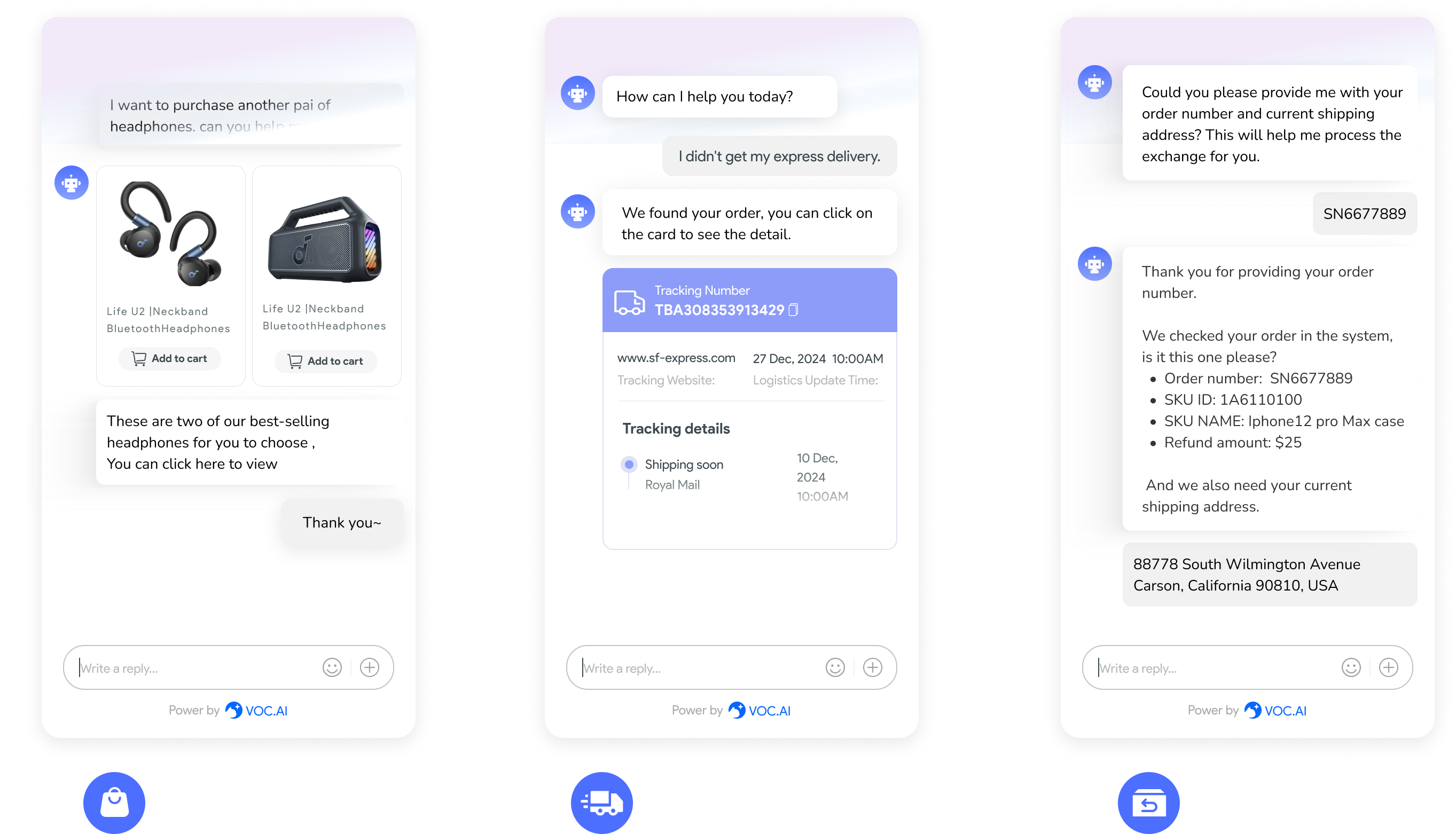
To further enhance user experience and drive conversion rates, consider integrating an AI chatbot like VOC AI Chatbot. This tool can help answer customer queries in real time, improving user satisfaction and reducing cart abandonment.
